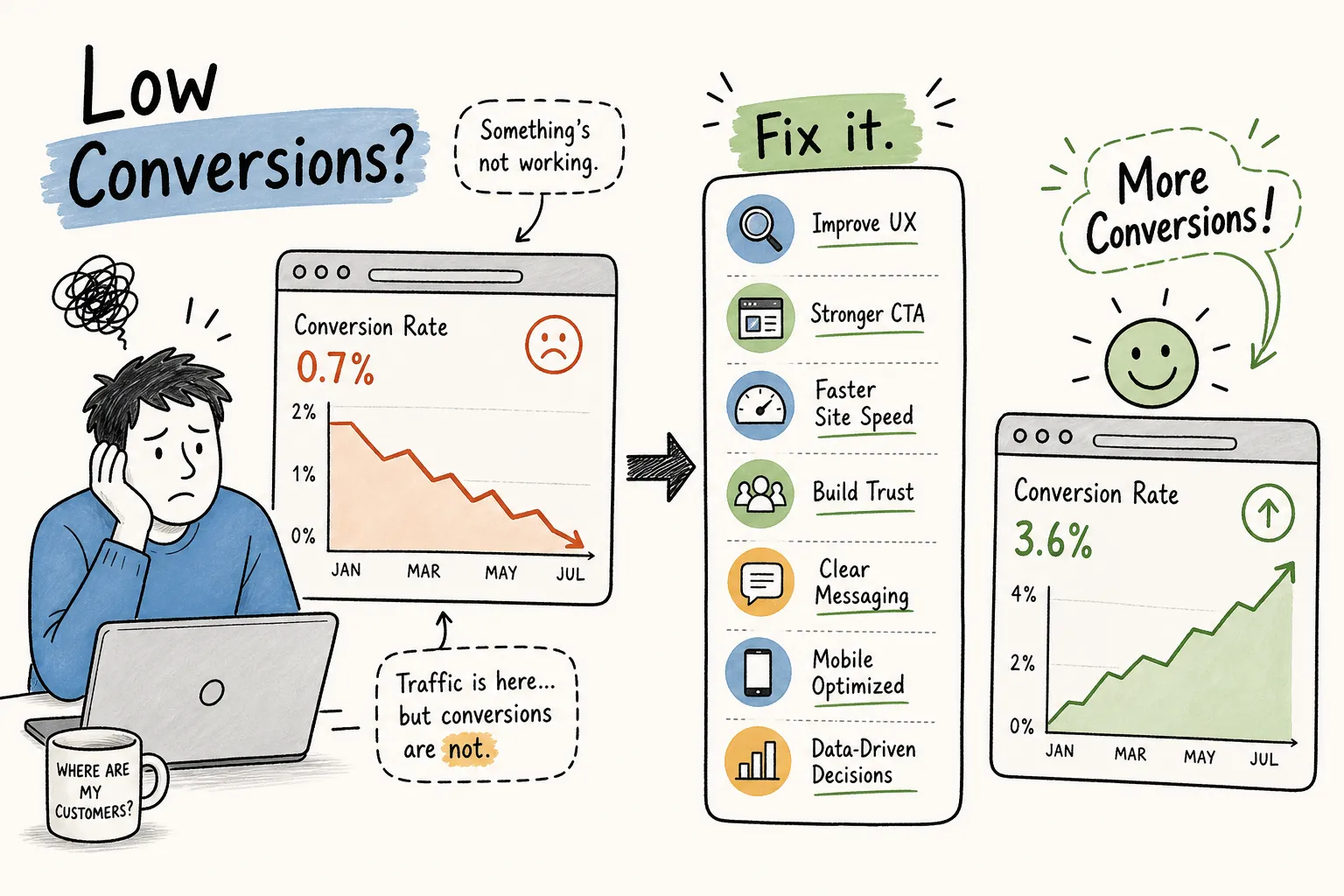
Most business owners facing disappointing website results reach for the same lever: more traffic. More ads, more social posts, more SEO effort. But if you're experiencing low website conversions, adding traffic won't fix the underlying site issues. When the Pixel Panda team runs conversion audits across South African small business websites, the same pattern keeps appearing: the website itself is quietly turning visitors away before they ever reach a contact form or enquiry button. Based on audits conducted across dozens of local sites, the problem is rarely traffic volume, it's conversion blockers already sitting on the page.
The average website conversion rate across industries sits at 5.13% in 2026. Many small business websites run well below that, some reports show sub-1% to 2% rates in specific sectors, and that gap doesn't close by buying more clicks. It closes by removing the blockers already sitting on your pages. The eight fixes below cover the four highest-leverage areas: speed and mobile, messaging clarity, form friction, and trust signals. Work through them in order and, for most small sites with analytics access, you can expect a clearer diagnostic picture within a week.
What your conversion rate is actually telling you
Is your site underperforming, or just in a low-converting industry?
Before you can fix anything, you need the right reference point. A 2% conversion rate is a serious problem for a financial services firm (where the average is 5%) but entirely normal for a fashion retailer (where the average sits between 1.72% and 2.3% depending on sub-category). Legal services vary even more dramatically, from 1.84% to 6.9% depending on the lead type. Comparing your rate to the wrong industry average creates either false confidence or unnecessary panic, and neither leads to good decisions.
Start by pulling your actual conversion rate from Google Analytics 4 for the past 90 days. Divide completed enquiries or goal completions by total sessions and multiply by 100. Then benchmark that number against your specific sector, not a generic "average website" figure. The gap between where you are and where your industry's top 25% sits is your real opportunity.
Why low website conversions keep happening despite more traffic
The compounding maths here are worth sitting with. If your site gets 2,000 visitors a month at a 1% conversion rate, you're generating 20 leads. Doubling your traffic to 4,000 visitors at the same rate gives you 40 leads, and costs roughly double your current ad spend. But improving your conversion rate from 1% to 2% gives you the same 40 leads from your existing 2,000 visitors, with zero additional spend. Fixing your conversion rate is almost always a better investment than scaling traffic first. Until the rate is healthy, every rand you spend on paid acquisition is leaking through a hole in the bucket.
Speed and mobile: the two fastest conversion killers
Fix 1: Page speed, the one-second rule that changes everything
A one-second delay in page load time reduces conversions by 7%. If your page takes more than three seconds to load, 40% of visitors will abandon it before seeing a single line of your pitch. These figures are consistent across multiple published performance studies and hold up at scale. The difference between a page that loads in one second and one that loads in four seconds translates to the difference between a 40% conversion rate and a 0.67% conversion rate on e-commerce benchmarks.
The most common culprits are unoptimised images, excessive third-party scripts (chat widgets, tracking pixels, social embeds loading simultaneously), and bloated JavaScript that blocks the page from rendering. Run a Core Web Vitals check via Google Search Console or PageSpeed Insights. The report will show you exactly where the time is going. Fix the largest image files and defer non-critical scripts first, Google's own PageSpeed guidance consistently identifies these two as the highest-impact changes for most sites, with the least technical complexity.
Fix 2: Mobile experience that stops costing you leads
Over 60% of global web traffic is mobile, and in South Africa mobile internet access is dominant, the country has one of the continent's highest mobile data usage rates. Yet most small business websites treat mobile as an afterthought: a scaled-down version of the desktop site that technically works but practically frustrates. Touch targets too small to tap accurately, pop-ups that are impossible to close on a phone screen, hover-dependent navigation menus that require a mouse cursor, and checkout flows designed for a keyboard. Each of these is a quiet exit point.
Test your own site on an Android device with a mid-range screen size, not an iPhone in your office. Tap every button. Try to close every pop-up. Complete the enquiry form with your thumbs. What you experience is what your visitors experience every day. The fixes are often straightforward: increase tap target sizes to at least 48 pixels, remove intrusive overlays on mobile, and simplify navigation to a clean hamburger menu with clear hierarchy.
Messaging clarity: the fix with the highest upside
Fix 3: Your headline is describing features, not outcomes
CRO studies from practitioners including Nielsen Norman Group and Unbounce consistently show that copy-driven changes outperform design changes by 5, 10 times in conversion impact. The biggest single lever within copy is the headline. Visitors decide within five to ten seconds whether your site is relevant to them, and that decision is made almost entirely on the strength of your opening message. Most small business websites lead with what they do. "We are a full-service accounting firm based in Johannesburg." That tells the visitor what you are. It does not tell them what they get.
Outcome-focused rewrites have produced conversion lifts of up to 161% in published case studies. The shift is simple in principle: move from describing the service to describing the result. "We build websites for small businesses" becomes "Get a website that books clients while you sleep." "Qualified financial advisors in Cape Town" becomes "Stop leaving money on the table with a personalised tax strategy." Write your headline for the visitor's goal, not your credentials. The credentials can live in the supporting copy below.
Fix 4: CTAs that tell visitors exactly what happens next
Generic button text destroys conversion rates. "Submit," "Contact Us," and "Learn More" all share the same flaw: they describe an action without clarifying what happens as a result of taking it. Specific CTA copy removes that uncertainty. "Book my free 30-minute call" tells the visitor the format, the commitment level, and the cost. "Get my free audit report" tells them they receive something tangible. Published tests show that first-person, outcome-specific CTA copy consistently outperforms generic alternatives by 10, 30%, making this one of the quickest wins in conversion rate optimisation (CRO).
Placement matters as much as copy. Your primary CTA needs to appear above the fold so it's visible without scrolling, and again at the end of each major content section where a visitor has just consumed information and is most likely to act. Avoid burying your only CTA in the footer. If a visitor has to hunt for the next step, most of them won't bother.
Low website conversions from form friction and checkout barriers
Fix 5: The field-count problem most lead forms ignore
Reducing form fields from 11 to 4 can increase conversions by 120%. That single statistic explains more about poor lead generation than most businesses realise. The instinct to collect comprehensive information upfront makes sense from an operational perspective: you want to qualify leads before spending time on them. But at the first point of contact, most visitors aren't ready to answer nine questions. They just want to start a conversation.
For a first-touch enquiry form on a service business website, 3, 5 fields is the practical target: name, email address, and ideally one question that helps you route the enquiry (such as service type or budget range). Ask yourself honestly whether each field is essential to starting the conversation, or whether you're collecting it out of habit. Phone number, company size, industry, how they found you, and preferred contact time can all wait until after the first response.
Fix 6: Account creation, surprise costs, and other abandonment triggers
Mandatory account creation before an enquiry or purchase is one of the most widely documented landing page conversion problems, yet it remains standard on many service and e-commerce sites. The visitor is at peak intent, they've read your content, decided you're credible, and clicked the button. Then they're hit with a registration wall before they can proceed. A large proportion leave. Guest checkout or friction-free enquiry (no account required) consistently lifts completion rates by 25, 35%.
The other major abandonment trigger is surprise costs revealed only at the final step. If delivery fees, setup costs, or VAT are not visible until the last stage of a process, visitors feel misled and exit. Similarly, generic error messages that don't explain what went wrong ("An error occurred. Please try again.") leave visitors stuck with no path forward. Both are fixable within hours: surface all costs early and write error messages that tell the user exactly what to correct.
Trust signals that actually shift hesitant visitors into leads
Fix 7: Social proof that speaks to your specific audience
Generic star ratings have diminishing effect when visitors have seen them everywhere. What converts hesitant visitors is specific, contextual proof: a testimonial that names a real outcome ("We increased bookings by 40% in the first month"), a location that a local visitor recognises, or a situation that mirrors their own. According to the 2024 BrightLocal Consumer Review Survey, 82% of South African consumers actively seek reviews before buying, compared to 70% globally. Social proof is not optional for local service businesses; it's a primary decision factor and a core component of any serious effort to increase website conversions.
For South African service businesses specifically, the highest-impact trust signals are a local phone number (not just a web form), a verifiable physical address, WhatsApp contact availability, and testimonials with full names rather than anonymous initials. These local legitimacy signals carry significantly more weight than global trust badges or international certifications that don't speak to the visitor's context. A testimonial from a business in their city, describing a problem they recognise, is worth ten star ratings from unnamed sources.
Fix 8: Where you place trust signals matters as much as having them
The businesses that fail with social proof aren't failing because they have no testimonials. They're failing because those testimonials are buried in a footer, stacked on an "About" page that receives minimal traffic, or placed at the top of the homepage where they serve as decoration rather than reassurance. Trust signals are most effective when they appear at the exact moment a visitor is most likely to hesitate: adjacent to the primary CTA, on the pricing or service page, and directly above the submit button on your enquiry form.
Think about the moment of doubt, then place your proof there. A visitor reading your service page is asking: "But has this actually worked for businesses like mine?" A single specific testimonial answering that question, placed right next to the "Book a call" button, does more conversion work than a full page of credentials placed elsewhere.
How to find your single biggest conversion killer without guessing
What a structured conversion audit actually covers
Many businesses try to fix everything at once and improve nothing measurably. A structured conversion audit works differently. It examines each layer of your conversion funnel in sequence: technical performance (speed scores, Core Web Vitals, mobile rendering), on-page messaging (headline clarity, value proposition, CTA specificity), form and funnel analysis (field counts, abandonment points, error handling), trust signal placement, and qualitative tools like heatmaps and session recordings. Each layer surfaces a different category of problem. Skipping one means missing an entire class of conversion blocker.
Session recordings show you where visitors get stuck or rage-click on non-interactive elements. Heatmaps show you which sections of a page attract attention and which are ignored entirely. Post-visit surveys reveal the psychological hesitations that analytics cannot detect: pricing anxiety, trust concerns, or confusion about what the service actually delivers. Combining these data sources gives you a ranked list of blockers with real evidence behind each one, rather than a gut-feel list of things to test.
The bottleneck-first principle that changes how fast you improve
Pixel Panda's free website audit is built on a single principle: identify the one constraint costing you the most leads, fix that first, measure the result, then move to the next. This approach is faster, lower-risk, and produces measurable outcomes rather than incremental tweaks that cancel each other out or make it impossible to attribute any change to a specific fix. A 40-point audit report sounds comprehensive, but it's paralysing when you have a business to run. One clear priority is actionable.
This is also why working with a single partner across strategy, build, and ongoing optimisation removes the handoff friction that loses fixes between teams. When the strategist, developer, and analyst are the same team, fixes don't fall between the cracks. The audit is free, it takes a few minutes to complete, and it identifies where to start, without requiring you to already know what's wrong.
The compounding case for fixing your conversion rate
The eight fixes above cover the four areas where most small business websites leak the most leads: slow or broken technical performance, messaging that describes the service instead of the outcome, forms that ask for too much too soon, and trust signals placed where nobody needs them. None of these require a full website rebuild. Most can be addressed within days, not months, and each one compounds on the others once the primary bottleneck is removed.
The maths is straightforward. Improving your conversion rate from 1% to 2% doubles your lead volume from the same traffic. Improving it to 3% triples it. Every month spent chasing more traffic without addressing low website conversions is a month where your existing audience, already paying attention, is being quietly turned away by problems you can fix. Start with a structured audit, identify your biggest single constraint, fix it, and measure. Then repeat.
If you want to stop low website conversions draining your marketing spend, a structured audit is the right starting point. Pixel Panda's free website audit analyses your site against the core CRO layers, surfaces the highest-impact gap, and gives you a clear starting point, no 40-point report, no guesswork. Fix your low website conversions, run your free audit at pixelpanda.co.za and know exactly where to focus first.
Related Pixel Panda resources: learn how growth-focused websites capture enquiries and explore digital growth systems for small businesses.